
1.1 Idea Generation
Mood boards
What I like about the home screen of the BBC website is that they have the top and most recent news there so that people can see the most important news first.
The way they target their audience on the BBC website is by burying them in information as the only reason people would go on the website is to see the latest news, however on the CBBC page it targets kids by allowing them to play games and catch up on their favourite shows
There isn't much to dislike about the BBC
website as they are such a big and professional company, they are going to have to have a well designed and layed out website
The purpose of the BBC website is to inform people of the latest news and stories and to educate people.
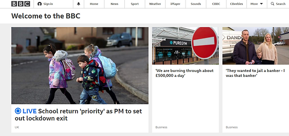

The house style of this website uses mainly black and white colours with big fonts, whilst on the CBBC page there is a lot more colour and interaction to appeal to kids. Just comparing the two logos, you can see that the BBC logo follows the house style of the BBC page and the same with CBBC
The features on both of these pages are headings and sub headings, interactive images and videos, etc.
Mood boards
What I like about this website is that it is a lot more colourful than the BBCs website however it is a much smaller business
There isn't much to not like about this website as it is informative and shows their skills
The purpose of this website is for people in South Wales to understand there services and products and buy them.
The features in this website are images, headings and sub headings, videos, etc.

The colour scheme of this website is black, orange and white, the fonts are quite big unless its labelling a sub heading and the theme of this website is video production.
The target audience of this website would be businesses that would like an advertisement video (customers) or anyone that would like a promotional video
Purpose
I am building this website as a place to put my course work and as a portfolio for future employers. I will put all my topics on this website, such as my product advertisement, my podcast, my personal project, etc. People would visit my website to see the type of work I've done and how experienced I am. These people would most likely be employers or clients.
Target Audience
The demographics of my target audience would be Men and Women around the age of 25 in the nature documentary business. The Psychographics of my website would be people interested in media as a whole but I would like people who are interested in nature/wildlife documentaries, so in the Psychographic groups the target audience would be Explorers. What would attract people to my site would probably be my work as the website isn't visually pleasing however I am thinking of changing that so it is more vibrant.
Site Map


House Style
Fonts


Most if not all of my writing on my site is in the font Avenir Light and font size 15. The headings vary in size as if it is the page header, it will be much bigger than a sub header. The page header will be bold, underlined, Helvetica font and 28 font size. The sub header won't be bold, it will be underlined, in the Futura font and 23 font size.
Screenshots
Wire Frame


Website Features
Pass features

Image
Merit features

Embedded Video
Navigation bar


Hyperlink to Document

Buttons to socials
Website Heading

Contact form

1.2 Feedback & Evaluation

Developing on this feedback, I have deleted the text at the bottom of the home page and all pages as it didn't tell anyone any details so it was useless it being there. However, I have left the social media buttons as they link to all the Wix social medias.

There isn't anything to develop on in this bit of feedback.

With this feedback, it is the same problem in that the text at the bottom of each page is hard to read. I have already fixed this issue but left the social media links so that people can find Wixs socials.
Website Progression Evaluation
For my 313 creating an interactive website unit, I have made mood boards, said my features, said my house style, said my target audience, purpose, etc. The first thing I did was make my mood boards that show other sites and their features. I did this with the BBC website and CBBC website as there is a tab that sends you to the CBBC site from the BBC site. Next, I talked about my purpose, target audience and legal terms. The purpose of my website is so I have a place to put all my work so that future employers can see. My target audience are possible employers (so men and women in the natural history/wildlife documentary business. After this, I made a site map which shows my current and future units and all my other pages like my about page, contact page and home page. Next, I showed my Fonts, House style and wire frame design for my pages. For my fonts, I showed the size and font style of my headings and text. For my House style, I showed the main colours I use in my website which would be black, grey and white. Finally, for my wire frame, I based the page off of my about page and made it on Adobe Indesign. Next, I showed some of the features I have used on my website so far, like buttons, hyperlinks and a contact form. For 1.2, I have been given feedback on my website and have responded and developed on it for example, I had an issue with the bottom of my page, where there would be some writing that was hard to read so I have deleted the writing as it didn't benefit my site. I have found using Wix to build a website and web design very simple and easy to understand. In future with this website I would like to keep putting up work that involves camera work and editing. I feel that my website shows my skills and capabilities very well, however I would like to find a new house style that is more visually pleasing. What I have learnt from this unit is that it is very easy to get the hand of things like Indesign and Wix itself.